Your Dashboard: Everything at a Glance
The dashboard is the home page of Klacks and shows the most important figures of your operation at a glance — accessible by clicking the logo in the top left of the header.
How it works
The dashboard is divided into four sections that you can expand or collapse individually (click the section row). In the top right there are buttons to expand all or collapse all, plus a menu to show or hide individual sections. Using the handle icon, you can reorder sections by drag and drop — visibility and order are remembered by your browser. Without sufficient permissions, only the "Locations" section is visible.
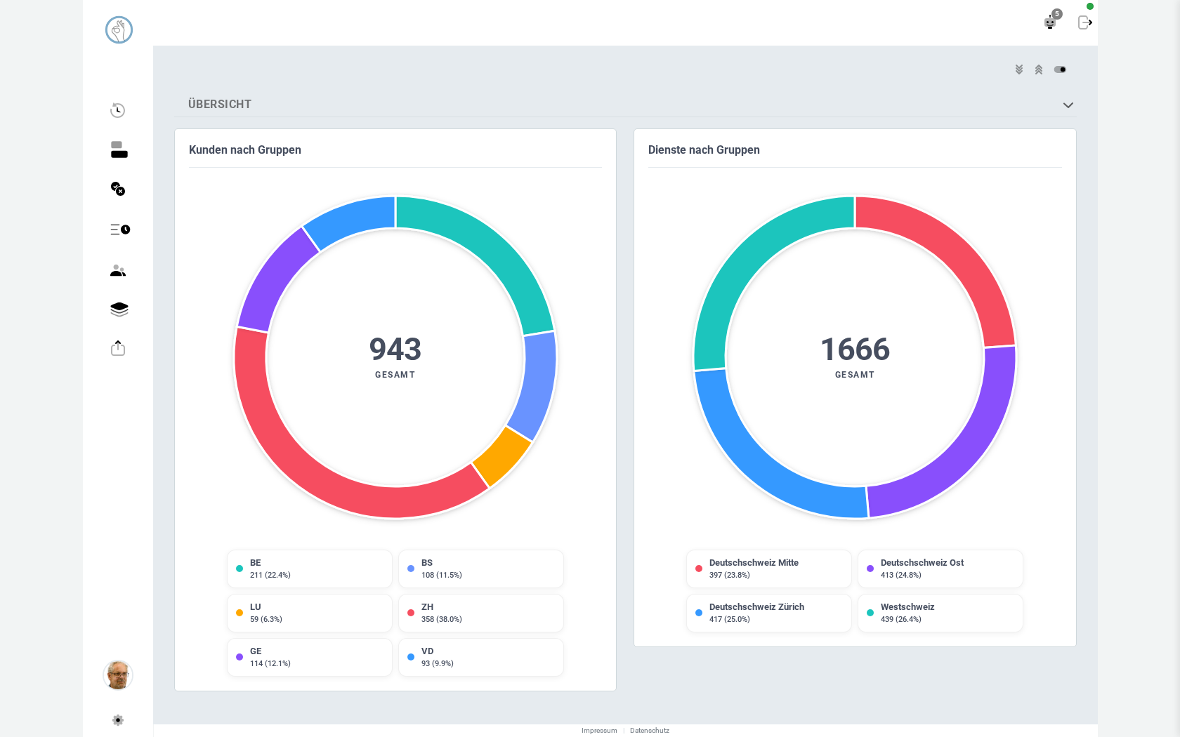
- Overview: two donut charts side by side, one slice per group (including subgroups). "Customers by Groups" shows how many customers each group has, "Shifts by Groups" how many shifts are assigned to each group. The total appears in the center, next to a legend with name, value, and percentage.
- Coverage & Confirmation: also two donut charts, always for the current calendar month and limited to the groups visible to you. "Coverage by Groups" shows, per group, how many of the planned shift slots for the month are filled; "Confirmed by Groups" shows how many assignments have already been confirmed (sealed).
- Resources: shows staff utilization for the selected year as a daily chart across 365 days. Details on how to read the bars and lines are on the dedicated Resource Monitor page.
- Locations: a map with all active addresses as clustered markers, switchable between "By City" and "By Group" (the choice is remembered). A search field helps you zoom to an address, and clicking a marker opens a popup with the breakdown by employees, external employees, and customers, plus a Street View link. Below the map, a tile view lists the same figures per location or group.
Good to know
- Without sufficient permissions, you only see the "Locations" section — the other three require appropriate rights.
- The order and visibility of sections are saved per browser, not per user account — on a different device you start again with the default view.
- The figures in "Coverage & Confirmation" always refer to the current month; there is no freely selectable time range.
- To interpret over- or under-coverage in the resource monitor, check the dedicated Resource Monitor page.
Try it yourself: Klacks Playground — login admin@test.com / P@ssw0rt1, data resets daily.